A week with cold turned productive
During my travel throughout south east Asia at one point I found myself in Bali. I had hoped to get a diving certificate but having just returned from a mountain hike I instead got stuck in bed for a week.
But this wasn’t a bad thing! As a developer often I feel that where I have my machine, I have my home. So it wasn’t long before I’ve made myself an office spot right next to the pool. And this is where the story begins.
If you want to skip to the end, please be my guest, you can find the TravelRates app here.
What is TravelRates?
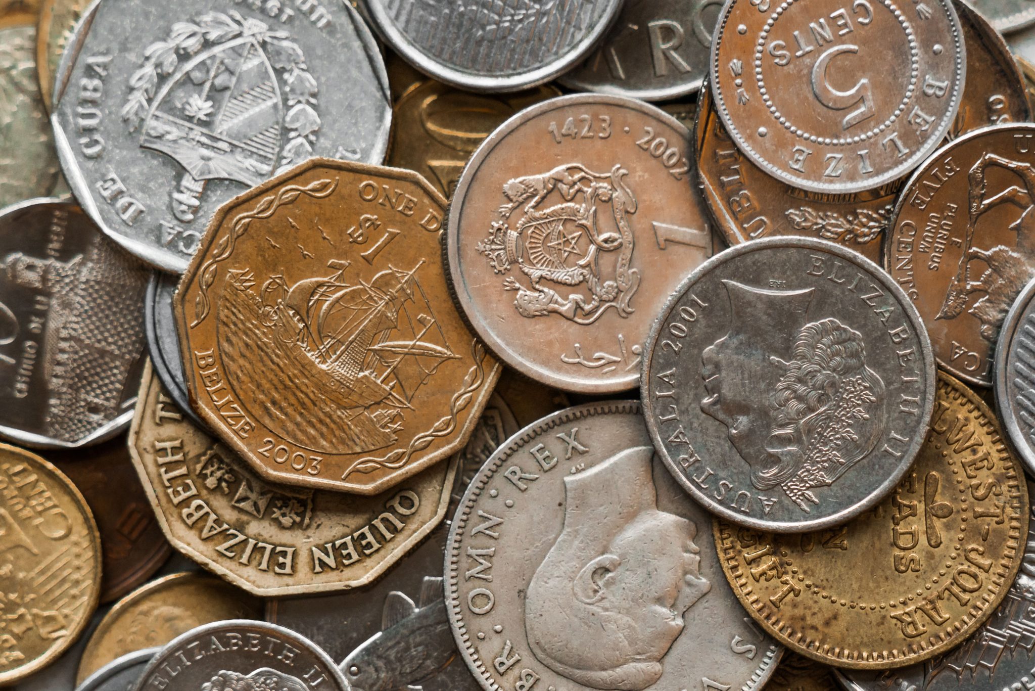
I’m glad you asked! During my travels I found that I often had to think of currencies, not only due to being in different countries but also because you end up talking money with other backpackers. Even between the two of us travelling we had two different “home currencies” along with the currency of the country we were in at that time. Being ~cursed~ blessed with the passion of software engineering I of course begun sketching an app before even searching for currency converter in the app store. This is why I begun writing TravelRates.
Why not just download it?
As I mentioned, I think I’m not the only developer who starts itching to code as soon as an idea springs to mind. However, I did see a genuine need for it, I had time to kill and more than that I wanted the experience for future ventures.
Writing an app of this kind is a perfect, reasonably large, actually useful project to begin with. It has only a few screens, a simple online integration. Put together, enough things to work on to touch on many of the features a mobile app requires.
So how do you build an app in a week?
Building it is no problem, even in a week, releasing it, well, we will get to that later. But let us start at the first tasks.
1. Decide what to do
It is very easy to just start coding. But think a bit, what are you actually going to do? Who will it be for? What are you solving?
I approached this by writing a Persona, a concept of a “standard user” for whom I wrote the app. This made it very easy to identify what I needed to focus on and also, what not to focus on. Otherwise it is easy to get carried away adding features that may seem cool but would’ve stopped me from ever finishing and getting to a release.
2. Focus on the MVP
When I knew what I wanted, I could remove everything that I didn’t need. Basically, to release anything, I focused on the Minimal Viable Product. What was needed to make it work. Because honestly, in most cases, anything aside from this could be a waste and lead to it never being released.
I did in fact add on a feature that set me back around 8-10 hours. I finally concluded that it wasn’t necessary and removed it instead of spending further effort trying to get right. Because, matching it with my persona I found that they wouldn’t benefit much from it.
3. Figure out how to do it
Before I started coding on the app I looked up what tools were available and what I thought would get me there fastest. I found Flutter, an amazing new framework for developing cross platform apps for Android and IOS. I downloaded the SDKs, set up my IDE and signed up to the Udacity Flutter course. It’s free, covers all the basics in a quick and fluent way. It got me to where I felt confident to start building my own app. All in less than two days. (this includes time for several dips in the pool as well)
4. Get on it
Then I got started. I designed the main screens, got it running on my device. One by one I replaced placeholder features with real ones ensuring it was working on the device as I went along. I kept from writing tests as most of my issues revolved around UI problems and had to be tested on the device/emulator. Only once all the code was in place I added in unit tests to get some coverage around the particularly tricky bits.
I mocked currency rates to begin with then proceeded to a downloaded fixed file. Finally download new rates on startup from an online source.
5. Release!
This is the most difficult step because it means you need to finish. Most personal projects never get this far but I had a purpose. I knew that if I don’t release, I’ll never finish it. If I don’t finish it I can’t use it as a portfolio and even if I may use it myself during my travels no one else will ever benefit from it.
Releasing on android is a breeze, what’s difficult is getting a nice app store page ready. This includes texts, screenshots and even video. When it comes to IOS well, it is a bit more complicated. It will cost you too. Unless you have like me, intention to release something you can make money off, you may be better off skipping IOS. It’s a shame but it does also keep the IOS app store clear of unfinished products. The signup process for the apple store is also a bit longer. It requires manual verification and review before release so prepare to spend a week waiting for the different steps.
Again, please check out the TravelRates page later and try it out.
What is this beautiful piece of software made of?
Flutter and love, mostly.
Flutter is a cross platform framework built on top of the language Dart. Dart looks and acts very much like C# or Java so anyone from either language will feel right at home. Flutter I’m not sure if I can compare with anything I’ve used. It builds the app and screens with a hierarchy of widgets which keeps callbacks and rendering functionality. It feels a little bit like building html with javascript embedded here and there.
I hosted everything on Gitlab and have made all the source code public so I hope it may help others attempting something similar. Unfortunately there are still a lack of examples and resources out there. The Flutter documentation is very good though.
What I learned
Polish takes time. Lot’s of it.
The basic functionality of the app took less than maybe two days to complete but I have spent ten times that to finish up. For the UX polish and various graphic resources such as the awesome logo I have the very talented Moe Aritsugi to thank for.
We spent lots of time preparing the 168 flags for each country/currency. Fixing animations to go in at the right speed and touch inputs to work properly. Even adjusting paddings and corner radiuses takes time but adds to the finish.
Releasing takes time
Polishing doesn’t stop at the UX level though, it also comes to the presentation of what you’ve built. I have spent hours preparing texts and screenshots of different sizes and getting these onto the Google Play and IOS App Store.
And that is after managing to sign up with a company account on my IOS developer account and getting it accepted. Paying the annual fee and then getting the app reviewed.
Google on the other hand makes this process so smooth that you can have your app downloaded from the store in a few hours from getting your application package file ready.
What’s next?
Getting people to download it of course, which I hope you can help out with!
There’s no roadmap aside from that but I’m very glad for any feedback that comes in and I will try to get updates to the app as often as I can to make sure the code is alive and kicking.
So try it out, break it or love and get back to me!


